
AusPost
CLIENT: AusPost (kinda)
LOCATION: In-my-dreams
CATEGORY: Doing things differently
OUTCOME: Rebrand - logo, typography, colour palette, iconography, copywriting
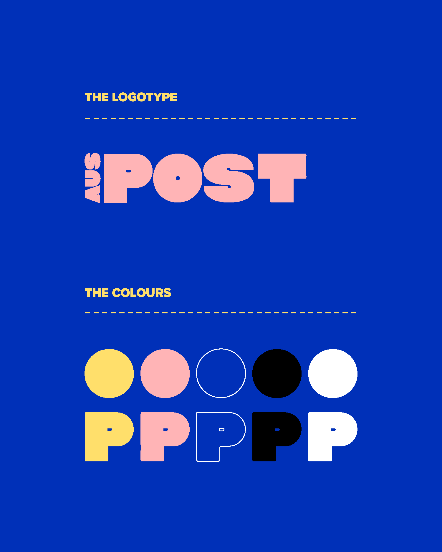
I got bored in lockdown 1.0 and thought to myself ‘Hey, you know what brand is so bland but could be wildly fun? Australia Post!!!’ So I did the only thing I know how - I redesigned it.
This *hypothetical* rebrand repositions the company as AusPost, with a visual identity that reflects their new ethos: putting the people at the heart of everything they do.
If you’ve gotten this far through my site, it’s probably pretty obvious now that I’m a sucker for brands that do something different. Like come on, a delivery service doesn’t have to be bland and corporate. it’s just a matter of finding that sweet spot between “We’re professional and really good at what we do, but like we're also a company that’s for the people.”
The visual direction for this takes a more bold, engaging and conversational approach to get the younger crowd more in touch with the brand.
*Sadly, this is fake and only exists in my dreams


How is this doing things differently?
Just because a brand is corporate and needs to keep up its ‘reliable’ image, it doesn’t mean it needs to be boring, bland, mundane, unengaging, dull, conventional, conservative, the list could go on but you get the picture.
After all, a postal company is the deliverer of many good things, (birthday cards, letters from grandparents, postcards, online shopping packages, etc). And the branding and messaging should support that, while at the same time being down-to-earth and honest about the not-so-good stuff (bills, car rego, speeding fines, you name it).
Being an adult and having to do adult things that adults do, shouldn’t have to be boring, and it’s up to these brands to help make these everyday tasks just a little more fun.